You are using an out of date browser. It may not display this or other websites correctly.
You should upgrade or use an alternative browser.
You should upgrade or use an alternative browser.
Does anyone like this??
- Thread starter crharker8
- Start date
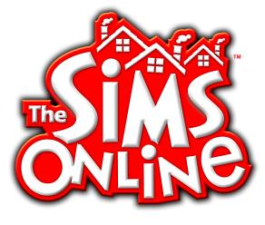
It's melting a wee bit... Though I appreciate the idea of using the new sims logo. For the purposes of discussion, here's the original they used back in the day:

Here's a revector by Fatbag:

I do like this old logo, but we can't really use it (or anything with "The Sims" in the name) without invoking the wrath of EA lawyers.

Here's a revector by Fatbag:

I do like this old logo, but we can't really use it (or anything with "The Sims" in the name) without invoking the wrath of EA lawyers.
PedrinhuBrr
Member
now, that's perfect man!What abouuuut THIS ONE!?
View attachment 1617
zc456
Well-Known Member
I like that!What abouuuut THIS ONE!?
View attachment 1617
zero35
Active Member
the red are TS1 series logo coloursI do like the green accent colour, since it's so "The Sims". The problem is, it's so "The Sims"... I can imagine the court cases over some colours.
the green are TS2 TS3 TS4 uses logo colours
the blue is Bustin Out logo colours
and URBZ use purple logo colours
LetsRaceBwoi
Well-Known Member
love it!What abouuuut THIS ONE!?
View attachment 1617
PedrinhuBrr
Member
you can make it all blue, like the official FreeSO, but plumbob has copyrigth. (fanmade by me. official logo with a little font edit)


Last edited:
PedrinhuBrr
Member
Nice, but plumbob has copyrigth
Hey guys,
Decided to style the text logo like The Sims 4, as per @crharker8 's example. I reshaped most of the font, though the "e"s are mostly the same. TS4's style went best with the existing logo, which is why I didn't go full TS1 bevel explosion. Thanks for your contributions.


