FreeSO: UI Make Over The Sims 4 Edition

Reaction:


  • Total voters
    23

Alessandro Needs A Server

Well-Known Member
Hi FreeSO Community!
As soon as The Sims Online UI looks way outdated i decided weeks ago to make something different. I was told that one day the game will support UI changes, here is my concept using the most close font to the in game one: COMIC SANS
Enjoy :)
(only CAS view) AS SEEN ON A 17.3 INCH 1080 SCREEN

PLS DON'T JUDGE CAUSE I LIKE THE SIMS 4 UI

x33Ggfj.png
 
Last edited:
It wouldn't be impossible to add this to the game. Creating some sort of 'HD pack' wouldn't be difficult, but you'd need to remake all the UI assets and then pack them back into FAR format.
 
As I have discussed in the discord, this will likely be supported officially and allow you to replace bmps, tgas with full alpha pngs. SVG is a possibility but rendering it is an issue. We'll also allow you to edit UIScripts with a visual editor, but a few things have to be cleaned up before you'd be able to tweak the position of images. (currently using hardcoded positions instead of the ones defined by ControlProperties)

Dunno whats with the randos in the back. Preferred the freeso logo colour gradients.
 
As I have discussed in the discord
kinda banned from discord
We'll also allow you to edit UIScripts with a visual editor
This is something I'm excited about. That, and some sort of city mesh creation, which shouldn't be difficult since it uses heightmaps to generate (AFAIK unity can handle these using the terrain object - these can be exported as raw image files and then imported using Photoshop, more info later)
 
This looks quite great, though since we're modernizing things, I'd suggest using something that is not Comic Sans.

On the other hand, if I were to make a modernized version of TSO UI, it would probably still had the TSO feel, but remade using vector graphics. Retaining the old feel but enabling proper hi-dpi support etc. That would be damn classy.
That's what i did with my version of the logo acutally, that remake was made weeks ago, i can remake it but i still like it to be the sims 4-y
Anyway here is my logo tweaked:
49UCK6h.png
 
When it comes to modernizing FreeSO/FreeSO UI, I'd suggest starting by choosing things that could be considered iconic, or simply, which are making TSO feel like TSO. For example, there is a lot of blue colour in the interface (similar to all the sim games). You could make a palette of colors used through out the game. You probably noticed that it's kinda skeumorphic somehow, with all the shadows, insets etc. which are giving it depth. These days, I think people just settle down on showing depth by color changes and simple, non-disturbing effects (like light shadow in Material Design icons on Android). Rounded shapes are a pretty distinctive part of TSO interface as well and how it all falls into place when you're switching between city view and lot view etc.

What I personally consider as good examples of modernizing stuff (you might not agree with me but whatever) are ThinkPads. While many believe that Lenovo really drifted too far from the original design etc. bla bla bla fanboy nostalgia bla bla bla, I really think they went the right way, by mixing the iconic features of their hardware design and modern ones (even though they missed a few spots).
T420_hero_04.jpg

t460-lead.jpg

They essentially went with a few things:
- it's black
- has a red dot on the keyboard (trackpoint)
- had red buttons for that trackpoint
- iconic thinkpad logo
- red light on the cover indicating that laptop is running
- simple black box, no curves etc.
- easy to open, repair etc.
- rubbery coating

Sure, they missed a few things that we consider irrelevant/redundant these days, but the basic, iconic features are there. It feels like a ThinkPad.

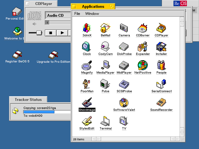
Another example that in my opinion really fits is the design of Haiku OS. I'm sure nobody cares what Haiku is etc. but essentially it's an open-source OS on BeOS, really old thing that had a cult following back in it's day. What I like about it is how it mixed good old design paradigms with modern ones.
So here is BeOS 5 in all it's glory:
beos5.big.png

And what Haiku did to it.
LVEE_2010_06_figure1.png

So they kept the way old UI is, it really feels like BeOS, but enhanced it with cool, 3D-like vector icons, gradients, effects etc. making it really look nice and scalable but also keeping distinctive features of the old one and building upon it (for example, windows look like tabs, but in Haiku, these are also stackable. It feels like that hipster retro thing.
Great post, i'll take consideration of that. For real. That's the kind of answer i like, with argumentations and clear examples. Thanks :D
 
I think it option per everyone client side. Give us four options: styles for TS1, TS2, TS3, and TS4 of course. Or If possible, provide tools to allow artistic fans to create their own custom "UI pack". I think Flexibility and Customization is important before we change the GUI globally without a "off/reset" switch.
 
Back
Top