jeremy_ade
New Member
I'm having fun imagining a redesign of the Freeso interface to unify it to the general style
(and in advance, sorry for my English, I'm French and very bad in this language)

Here is the "CAS",
In the first category we find the change of sex, skin, and description (And we could very well put the personality and age on Simitone)
And the fourth button would be the Sims Creator (which would be really cool to have in freeso) to be able to paint the texture of his sims :

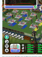
You can see that some icon are grayed out, because you are not yet in a lot :

You can see the life mode interface, which could be suitable for both FreeSO and Simitone :

You can see here that the gray button has become clickable (and also a prism appeared to see where you are on the map) :

Really looking forward to having your feedback and hearing your ideas")
(and in advance, sorry for my English, I'm French and very bad in this language)
Here is the "CAS",
In the first category we find the change of sex, skin, and description (And we could very well put the personality and age on Simitone)
And the fourth button would be the Sims Creator (which would be really cool to have in freeso) to be able to paint the texture of his sims :
You can see that some icon are grayed out, because you are not yet in a lot :
You can see the life mode interface, which could be suitable for both FreeSO and Simitone :
You can see here that the gray button has become clickable (and also a prism appeared to see where you are on the map) :
Really looking forward to having your feedback and hearing your ideas